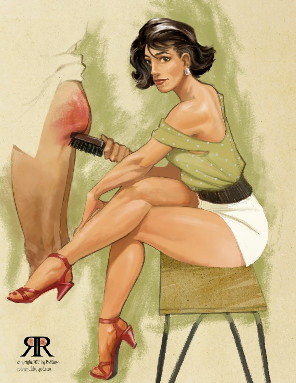
“So let’s start with some basic washes of color to get the tonal values established. Not too worried at this point about edges. That can all be cleaned up later. I use the skin and hair tones to guide all the other values and colors, so blocking them in is the first task. Now some other colors can be blocked in, careful to avoid ones that will overwhelm the flesh tones. The shoes are a little intense, but that’s ok – I know that they will eventually be balanced by the redness I will be adding to her hubbie’s backside. At this point, I decided to add a ‘halo’ around the edges, both to add a little visual energy, and allow her shorts and his shirt to read even though they are the same as the background (another trick of the old illustrators, letting some part of the foreground unpainted so the background shows through).”
